Written by: Nadine AbdElMegeed
What This Blog Covers:
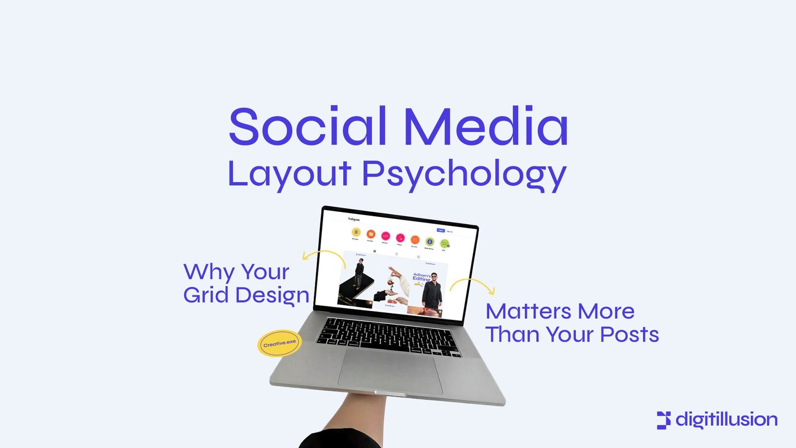
This blog explores why the overall layout of your Social Media Psychology grid impacts audience perception more than individual posts. Readers will learn how visual psychology, consistency, and strategic arrangement influence engagement, memorability, and brand trust, with actionable tips to optimize their grids for maximum impact.
Introduction
Most brands obsess over individual posts crafting catchy captions, trending graphics, or viral reels while neglecting the bigger picture: the social media grid.
Your grid is not just a collection of posts; it’s a visual narrative that communicates your brand identity, professionalism, and emotional tone. Every user scrolls past dozens of grids in seconds. The overall layout, sequence, and consistency often determine whether they stop, follow, or scroll past, long before they read a caption or comment.
High-performing brands understand that the psychology of the grid matters more than any single post. Strategic grid design builds trust, encourages engagement, and makes content instantly recognizable even out of context.
Why Grid Design Matters More Than Individual Posts in Social Media Psychology
Visual perception happens rapidly. The brain interprets patterns, color harmony, and structure subconsciously.
A well-designed grid communicates:
• Brand consistency: demonstrating professionalism and reliability.
• Emotional tone: conveying warmth, boldness, calm, or energy at a glance.
• Storytelling flow: guiding viewers through your content intentionally.
Even if individual posts are excellent, a chaotic, inconsistent grid can:
• Reduce perceived credibility.
• Confuse audience expectations.
• Make your brand forgettable or inconsistent.
People remember the grid as a whole, not isolated posts.
Real-World Examples of Grid Psychology
1. Thematic Grids for Brand Identity
Brands like Glossier maintain grids with consistent color palettes, spacing, and mood.
Results:
• Instant brand recognition.
• Reinforces calm and minimalism aligned with product aesthetics.
• Each post contributes to a larger emotional narrative.
2. Sequential Storytelling
Some brands design grids to create mini-stories across three or nine posts, leading viewers through a visual journey.
Results:
• Increases time spent on profile and engagement.
• Builds anticipation for future posts.
• Enhances memorability because the grid itself becomes a narrative device.
3. Visual Balance and Focal Points
High-growth brands strategically place images with high contrast or key messages in specific positions to create balance.
Results:
• Guides the eye naturally across the grid.
• Highlights important content without overwhelming viewers.
• Communicates professionalism and design expertise subconsciously.
Key Principles to Optimize Your Grid Design
1. Color Psychology and Palette Consistency
Color triggers emotion. Consistent palettes create harmony, strengthen recognition, and align the grid with brand values.
Pro tip: Use 2–4 core colors strategically. Avoid adding trending colors that clash with your brand tone.
2. Layout and Composition
Symmetry, spacing, and alignment influence perceived professionalism. A cluttered grid signals chaos, even if individual posts are strong.
Pro tip: Experiment with row, column, or checkerboard patterns to create rhythm and breathing space.
3. Visual Hierarchy
Place attention-grabbing content where viewers naturally pause, such as the center or top-left of the grid.
Pro tip: Rotate high-contrast or emotionally charged visuals strategically, so they punctuate the grid rather than overwhelm it.
4. Pattern Recognition and Predictability
The brain craves patterns. Repeating layouts, framing, or motifs allow viewers to scan quickly and recognize content instantly.
Pro tip: Introduce subtle variations within patterns to maintain interest without losing consistency.
5. Integrating Branding Elements
Consistent fonts, graphic overlays, and iconography reinforce brand identity. Even if users see a single post out of context, the grid signals your brand immediately.
6. Testing and Analytics
High-performing brands track scroll behavior, engagement per post, and audience retention across the grid.
Pro tip: Adjust posting sequence, layout patterns, and visual themes based on analytics to ensure your grid performs as a holistic experience.
Conclusion
Social media success isn’t just about individual posts, it’s about the cohesive visual experience your grid delivers. Strategic grid design communicates professionalism, emotional alignment, and brand consistency at a glance. High-growth brands leverage color psychology, layout patterns, visual hierarchy, and storytelling to create grids that engage, convert, and leave a lasting impression.
A grid is more than a gallery,it’s your brand’s silent storyteller. When designed intentionally, it builds recognition, trust, and engagement without relying solely on content virality.
Your audience decides in seconds if your profile is worth following. Does your grid tell the story you want them to feel?
At Digitillusion, we design social media grids that do more than look beautiful, they communicate your brand, convey trust, and guide engagement at a glance.
Let’s turn your grid into a visual narrative that stops thumbs and wins hearts.
Start your grid transformation with Digitillusion today