Written By: Nadine AbdelMegeed
This blog teaches designers, marketers, and brand strategists how to use visual pattern, rhythm, and repetition strategically to build brand identity, instill confidence, and make your brand instantly recognizable. Readers will learn actionable techniques, real-world examples, and practical applications that strengthen visual consistency and audience trust.
Why Visual Consistency build brand Confidence
Brand confidence isn’t something you announce, it’s something you show. Every time someone interacts with your brand, your visuals communicate trustworthiness, professionalism, and clarity even before your words do. That’s where pattern, rhythm, and repetition come into play.
These are not just design buzzwords. They are psychological triggers that help your audience feel oriented, comfortable, and aligned with your brand. Humans are naturally drawn to predictability. When visual elements repeat whether it’s color, typography, spacing, or icons our brains interpret it as cohesion and authority.
For small businesses and emerging brands, mastering these principles can transform every touchpoint into a confidence-building experience, without needing flashy effects or high-budget campaigns.
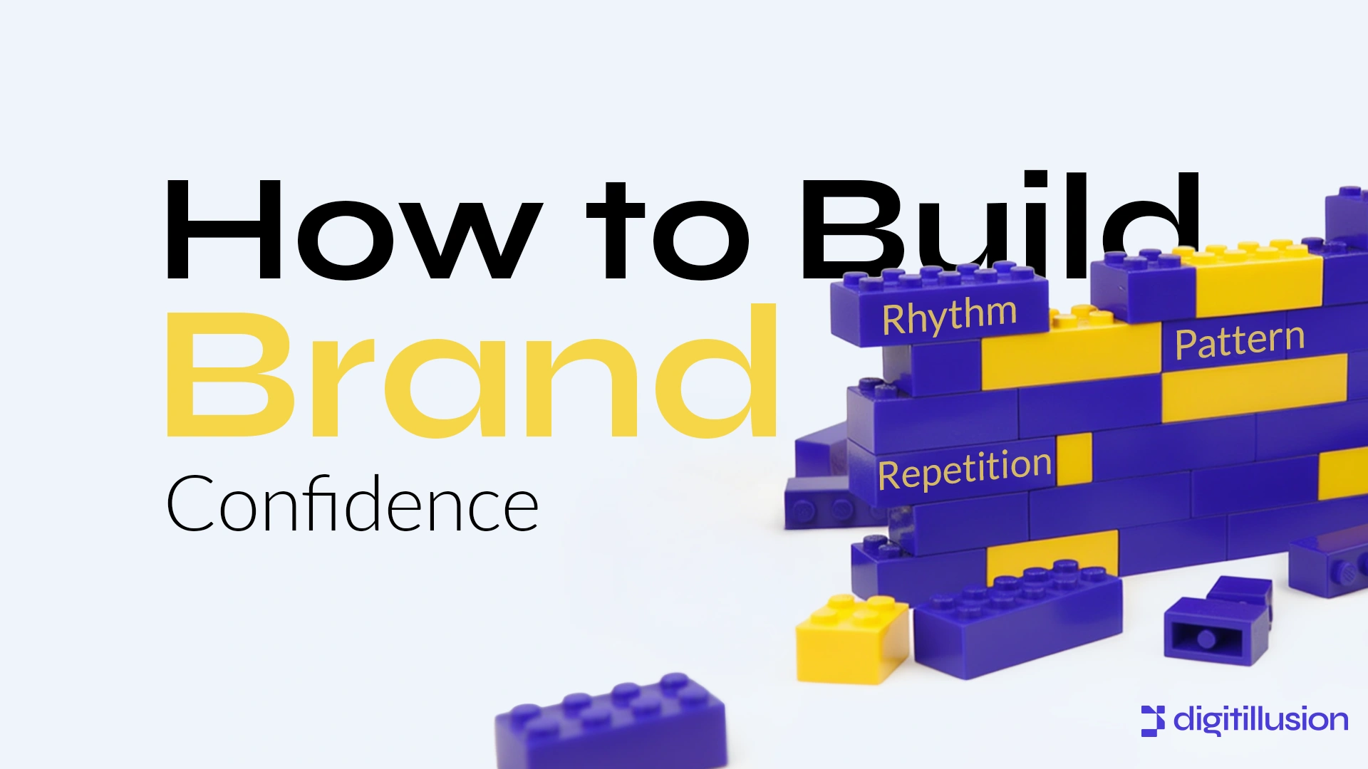
The Mechanics of Pattern, Rhythm, and Repetition
- Pattern is the deliberate repetition of visual elements. Think recurring shapes, icons, or color accents. Patterns create cohesion and make a brand instantly recognizable.
- Rhythm refers to the visual pacing in layouts. By controlling spacing, alignment, and repetition, designers guide the eye naturally, ensuring information is absorbed in the intended order.
- Repetition reinforces brand memory. Using consistent design cues across channels, from social posts to packaging, strengthens familiarity, making the brand feel reliable and professional.
The combination of these elements is powerful: they subconsciously communicate consistency, clarity, and competence.
Real-World Examples of Confidence in Visuals
1. Spotify’s Visual Identity
Spotify’s playlists, social posts, and campaigns consistently use vibrant color blocks, wavy patterns, and circular motifs. Each element, though simple, creates a cohesive visual rhythm. Users don’t have to read the logo or the app name, they recognize the brand instantly.
Why It Works:
- Repetition builds recognition; every visual “beat” reinforces familiarity.
- Patterns and rhythm create energy and movement without animation, signaling a brand that’s confident and modern.
2. Duolingo’s Brand Visuals
Duolingo applies bright, repeating icons, mascot imagery, and playful gradients across its interface and social campaigns. The rhythm of the visuals guides users through learning content effortlessly, while repetition establishes trust and predictability.
Why It Works:
- Patterned elements reinforce brand identity without feeling monotonous.
- Rhythm in layouts communicates approachability and user-friendly professionalism.
For further reading on how repetition affects design perception, see Smashing Magazine: The Role of Pattern and Repetition in UI Design.
3. Digitillusion’s Approach
At Digitillusion, we strategically apply pattern, rhythm, and repetition to every brand we work with:
- Layered Motifs: Repeated shapes, gradients, or iconography create consistency across web, social, and print assets.
- Rhythmic Layouts: Controlled spacing and alignment guide the viewer naturally, making complex information digestible.
- Typography and Color Consistency: Uniform fonts, sizes, and palette usage reinforce brand recognition and confidence.
How to Apply These Principles Without Feeling Repetitive
- Define a Visual Language: Create a palette, typography set, and icon system that can repeat across all materials.
- Use Rhythm to Guide Attention: Structure layouts to create flow, visual breaks, repeated elements, and alignment lead the eye logically.
- Strategically Repeat Motifs: Repetition builds recognition; vary scale, color, or context to keep it engaging.
- Balance Predictability and Surprise: Patterns and repetition create trust, while occasional contrast grabs attention.
- Test Across Channels: Ensure your visual language works in social posts, emails, website pages, and printed materials.
When done correctly, pattern, rhythm, and repetition instantly convey stability and professionalism, allowing audiences to trust your brand without questioning it.
Conclusion
Confidence is visible. It’s in the way a brand arranges visuals, repeats its elements, and sets a consistent rhythm across touchpoints. Brands that use pattern, rhythm, and repetition intentionally feel reliable, recognizable, and professional, even before a single word is read.
A confident brand doesn’t need to tell people, it shows up consistently and memorably, every time.
Your visuals can do the heavy lifting for your brand’s credibility. At Digitillusion, we turn patterns, rhythm, and repetition into strategic design tools that amplify recognition, build trust, and make your brand instantly confident in the eyes of your audience. Every asset tells a story, let’s make yours speak with authority. Contact Digitillusion and let’s make it happen.