Written by: Nadine AbdELMegeed
(Featuring Sentinel Storage )
Behind every tap, swipe, or click on your Digital Marketing Ads , there’s psychology.
Not targeting. Not budget. Psychology.
Because people don’t click on Digital Marketing Ads because they understand them, they click because they feel them.
At Digitillusion, we saw this firsthand while working with Sentinel Storage, one of the leading storage solution providers in the region. Even in a practical, logic-driven industry, the secret to engagement wasn’t pricing or product.
It was emotional.
1. People Click On Digital Marketing Ads Because They Feel, Not Because They Think
When Sentinel Storage came to us, their Digital Marketing Ads were technically perfect, but emotionally invisible.
Boxes. Locks. Price points. All logic, no feeling. We flipped the narrative. Instead of selling “space,” we sold peace of mind.
Our creatives showed:
- A young couple decluttering their home.
- A business owner organizing stock confidently.
- A family freeing up their living room for life again.
2. The 3-Second Rule of Visual Trust
Audiences decide whether to trust your Digital Marketing Ads in under three seconds. That’s it.
When we redesigned Sentinel’s visuals, we kept it clean, warm, and believable.
- Real lighting, not filters.
- Consistent color palette.
- Subtle copy: “Your Space, Your Terms.”
Simple, grounded, and confident.
Result → More clicks, more trust.
At Digitillusion, we call it: The 3-Second Rule of Visual Trust.
If your viewer doesn’t trust what they see instantly, they’ll never stay long enough to read what you say.
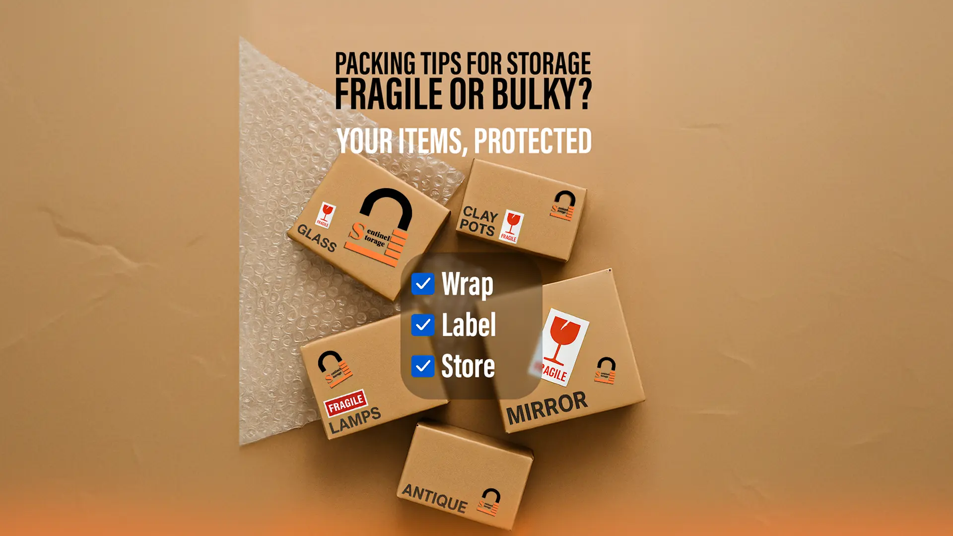
3. When Digital Marketing Ads Strategy Fails Because of Design
Sentinel’s early Digital Marketing Ads had strong targeting and great offers, but the visuals were crowded. It had too much text, multiple CTAs, competing colors.
We simplified:
One emotion → Relief.
One message → “Reserve in 60 seconds.”
One CTA → “Book Now.”
4. The Mirror Effect: When Your Audience Sees Themselves
People don’t connect with features, they connect with familiar feelings. We stopped showing empty units and started capturing real moments that resonate with our target audience.
For example, we used a static image of a family celebrating Eid after safely storing their belongings.
Another visual that instantly connects on an emotional level shows a child giving his mother a bouquet of flowers on Mother’s Day which is a moment that speaks to every mother’s heart.
5. Simplicity Beats Noise
Clarity isn’t boring, it’s powerful.
We assume that the more effects, text, or transitions an ad has, the more engaging it’ll be.
However, in reality the human brain doesn’t reward complexity, it rewards comprehension. When your audience understands your message instantly, they feel smart, confident, and in control. That’s an emotional win.
We cut down Sentinel’s content to one core promise:
“Reserve your space in two minutes. Move when ready.”
No clutter. No chaos. The human brain loves what’s easy to process. Engagement tripled. Your creative goal isn’t to impress. It’s to be understood.
6. The Color Code of Conversion
Color psychology plays silently but powerfully.
For Sentinel, we used:
- Sunrise Orange → Warmth, action, optimism.
This palette distinguished Sentinel from competitors while preserving brand credibility.
In regional A/B tests.
Color sets the mood before words do, so make sure to choose wisely.
7. The Human Algorithm
Algorithms distribute your Digital Marketing Ads whereas humans decide to click them. Every creative we built for Sentinel had one invisible goal: Make people feel safe, seen, and certain. Because in a digital world flooded with noise, safety is emotional currency.
When a person feels understood by your brand, they don’t just engage , they commit.
That’s not design. That’s psychology.
A. The Move That Started a New Chapter
Visual:
A candid shot of a young couple surrounded by half-packed boxes in their living room. Natural daylight, a little mess, and real smiles not posed. You see handwritten labels like “kitchen” and “memories.”
Caption:
- Some moves aren’t just about changing places, they’re about making room for what’s next.
- Whether you’re starting over or starting small, Sentinel keeps your space and your memories safe until you’re ready for the next chapter.
- Secure storage, made for real life.
B. The Pause Before the Celebration
Visual:
A mother and child placing decorations into a storage box after Eid. The background shows lived-in warmth rugs, food trays, soft light, not a showroom setup.
Caption:
- The moments that matter most deserve a little space to breathe.
- From Eid décor to family keepsakes, store them with care until it’s time to celebrate again.
- Sentinel Storage protecting the stories behind every box.
C. Making Space for Growth
Visual:
A small business owner in her workshop, clearing out old stock. You see labeled boxes stacked neatly, the owner wiping her brow proud, not posed.
Caption:
- Growth doesn’t always mean having more, sometimes it means creating space for better.
- Sentinel Storage helps small business owners make room for what’s next safely, simply, and smartly.
Refining Realism: Bridging Visuals and Voice
A major insight from our review was that earlier Sentinel visuals leaned too far into idealized, unrealistic imagery. The designs often appeared overly polished or staged clean empty units, generic families, and picture-perfect lighting that didn’t mirror how customers actually experience storage.
This disconnect extended into the copywriting: captions and headlines often spoke in broad, promotional terms that didn’t reflect the actual asset or emotion behind it.
People don’t connect with perfection, but rather they connect with real moments. Our new direction focused on humanizing the brand through realistic visuals and emotionally aligned copywriting.
Each asset was designed to feel lived in, grounded in authentic experiences like moving homes, celebrating family occasions, or growing a small business.
Final Thought
Clicks aren’t luck: They’re emotional reactions, designed with intent.
If your creatives overcomplicate, confuse, or lack humanity. They’ll kill your digital marketing ads before they even load. But when you design for trust, clarity, and emotion, you don’t just earn clicks. You earn connections.
At Digitillusion, we don’t design Marketing Ads, we design emotions that convert.
Contact us now Talk To Us
FAQ
What drives clicks?
Curiosity + relevance.
Do visuals matter more than copy?
They stop the scroll. Copy closes the click.
What kills Digital Marketing Ads performance?
Clever ads with no clarity.